The CampusPress Flex Theme offers a wide variety of pre-designed patterns.
This collection of components represents the Northeastern branded design patterns available under “patterns” in the block editor.
Headers
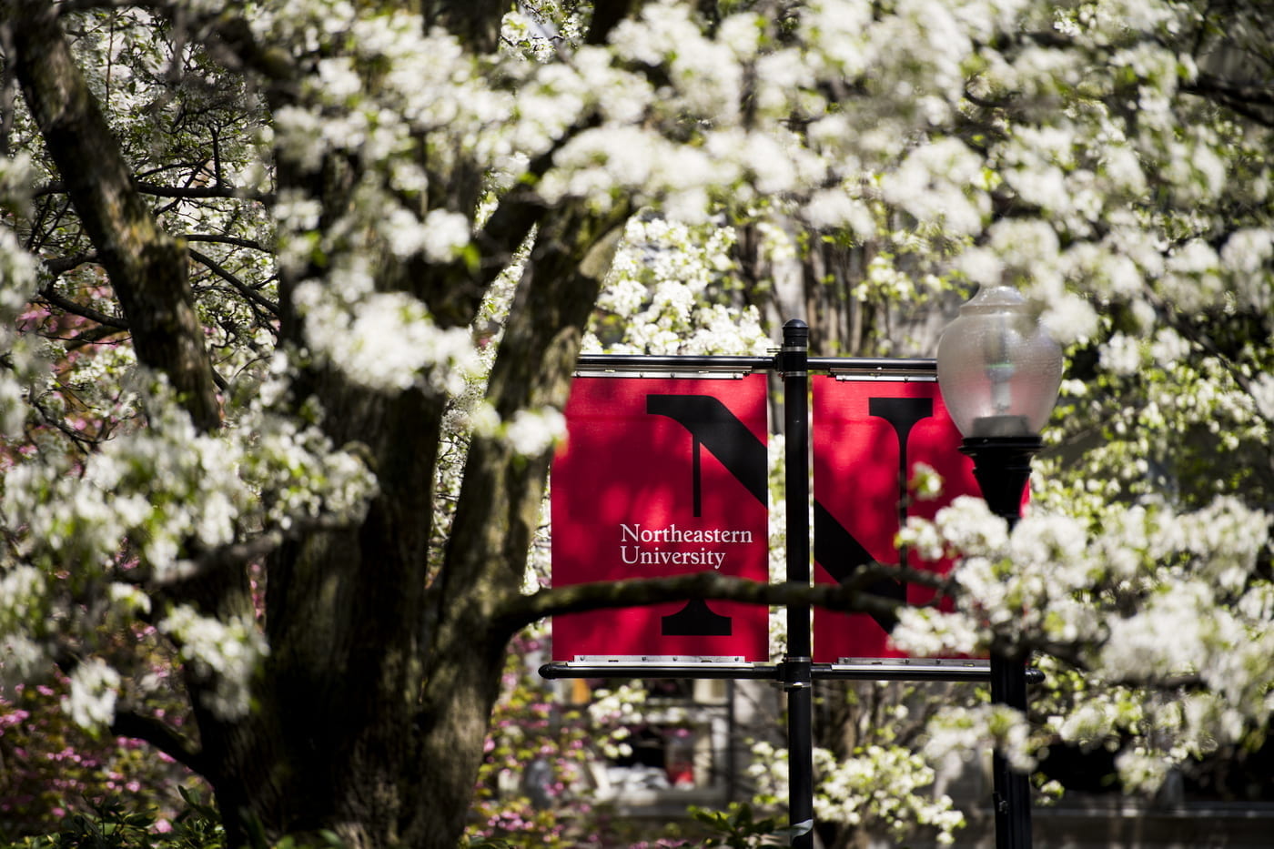
Hero
The hero header includes a full-width decorative background image, a heading, and a call to action link.
The hero is best used at the top of a page using a background image with dimensions of 16:9. Display text highlights the content a viewer will find on the page. By default, this pattern includes a call to action button.
The hero pattern fits best at the top of the page
Page Banner
The page banner heading includes a full-width decorative background image and a heading.
Similar to the Hero, the Banner works best using a background image with dimensions of 16:9. The Banner is best used when a call to action button is not needed.
Consectetur Commodo Purus Vestibulum
Page Section – On Page Banner
This section includes a decorative background graphic, a heading, and a paragraph.
The page section banner is best used to visually separate sections within a page and to call out the type of content a viewer will find below it.

Training Opportunities
Never stop learning by leveraging Northeastern supported training opportunities.
Page Section – On Page Banner – CTA
This section includes a decorative background graphic, a heading, a paragraph, and a call to action link button.
The page section banner that includes a button is best used to visually separate sections within a page and to persuade the viewer to take action.

Research
Global challenges are best solved in a barrier-free learning environment, where digital collaboration fuels innovation between disciplines, universities, and industry.
Text
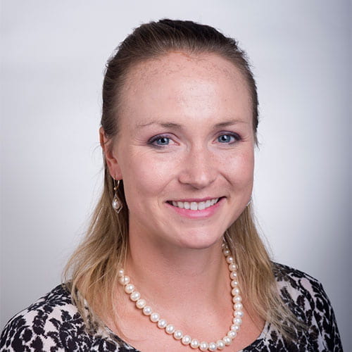
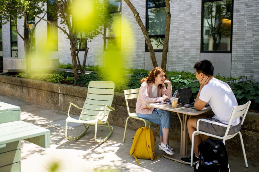
Profiles
Each profile block includes a heading, a paragraph, and a square headshot photo that can be set to either side of the text column.
Profiles are best used to highlight a team member or distinguished guest.
Engagement and Experience
“Vivamus sagittis lacus vel augue laoreet rutrum faucibus dolor auctor. Fusce dapibus, tellus ac cursus commodo, tortor mauris condimentum nibh, ut fermentum massa justo sit amet risus. Aenean eu leo quam. Pellentesque ornare sem lacinia quam venenatis vestibulum. Donec id elit non mi porta gravida at eget metus. Donec sed odio dui.”
Mary Doe
AssocVP
Page Section – 3 Circle – Media – CTA
The 3 circle page section includes three columns—each with an image cropped into a circle, a heading, a paragraph, and a call to action link button.
This column style, 3 circles, includes call-to-action buttons that can help a viewer navigate to different topics within your site. If preferred, the circles can be changed to squares in order to fit a desired site appearance.

Faculty
Key technology resources for teaching and collaborating across the university.
Students
Take your academic experience to new heights with these key technology resources.

Staff
Increase productivity and facilitate collaboration with these key technology resources.
Page Section – 3 Square – Media – CTA
The 3 square page section is the same layout as the “Page Section – 3 Circle – Media – CTA” pattern, except it displays images using square dimensions.
Work Example 1
Use the call-to-action button to link to the page where your project is outlined in depth.
Work Example 2
Use the call-to-action button to link to the page where your project is outlined in depth.
Work Example 3
Use the call-to-action button to link to the page where your project is outlined in depth.
Page Section – Intro – 2×2 grid – Media
This section begins with a full-width heading and paragraph. After the full-width header it breaks in a 2-by-2 grid, with each grid section containing an image, a heading, a paragraph, and a call to action link button.
The 2×2 page section grid is best used to highlight four different topics and to link out to their own web page.
Another section to promote your work and ideas
Donec sed odio dui. Maecenas sed diam eget risus varius blandit sit amet non magna. Aenean eu leo quam. Pellentesque ornare sem lacinia quam venenatis vestibulum. Curabitur blandit tempus porttitor.
Library Study Spaces
Is open for studying and offers different types of workstations and rooms.
Registrar-Managed Classrooms
Request the use of an academic classroom managed by the Registrar. Faculty and staff may do so at while student groups can request a classroom.
Center for Student Involvement
Across the Boston campus may be booked by students, faculty, or staff online or direct through the appropriate offices.
External Events and Conference Programs
Available to those outside the Northeastern community.
Page Section – 2 column- Media- Short Content
This section is split into two 50% width columns. The left column includes a featured image. The right column includes a heading, a paragraph, and a call to action link button.
The two-column short content block is best used to highlight a topic with a featured image.
Print your documents
Students have access to general-use printers in several campus locations. PaperCut is the software that allows students to release printed materials at any of these locations.
Page Section – 2 column- Media- Long Content
This section is split into two 50% width columns. The left column includes a featured image. The right column includes a main heading followed by several topics. Each topic is composed of a subheading that functions as a link, with a paragraph below the subheading.
The two column long content block is best used to highlight multiple topics along with a feature image.

Teaching and Research
Canvas
The Canvas learning management system is mobile-first, reliable, accessible, and delivers highly customizable and experiential teaching and learning environment. Elevate the learning experience with Canvas support and resources including training, term checklists, and personalized consulting.
Research Computing
High-end computing solutions and comprehensive support are available to help bring faculty research to light, no matter what your discipline. The university partners with the Massachusetts Green High Performance Computing Center in Holyoke, MA to provide high-speed and high-performance resources.
NUflex
NUflex classroom technology is a web-conferencing system that supports teaching and learning, and provides digital flexibility for both instructors and students through cameras, microphones, computers, a projection system, and integrated software.
Page Section – Title 2 column
This block includes a full-width heading followed by two 50% width text columns.
The title block with two columns is used to provide details in a way that best fits within a page or section of your site.
Section header with a pithy title
Praesent commodo cursus magna, vel scelerisque nisl consectetur et. Donec id elit non mi porta gravida at eget metus. Aenean lacinia bibendum nulla sed consectetur. Lorem ipsum dolor sit amet, consectetur adipiscing elit. Vivamus sagittis lacus vel augue laoreet rutrum faucibus dolor auctor. Cras justo odio, dapibus ac facilisis in, egestas eget quam.
Praesent commodo cursus magna, vel scelerisque nisl consectetur et. Donec id elit non mi porta gravida at eget metus. Aenean lacinia bibendum nulla sed consectetur. Lorem ipsum dolor sit amet, consectetur adipiscing elit. Vivamus sagittis lacus vel augue laoreet rutrum faucibus dolor auctor. Cras justo odio, dapibus ac facilisis in, egestas eget quam.Praesent commodo cursus magna, vel scelerisque nisl consectetur et. Donec id elit non mi porta gravida at eget metus. Aenean lacinia bibendum nulla sed consectetur.
Page Section – Title Lead intro
This section includes a heading, a medium font size paragraph, and a small font size paragraph for supplemental text such as a quote.
Title Lead Intro block is best used to provide details on a singular topic or to provide a summary of a section or page.
What learners need today is connection.
This means removing physical, geographic, and cultural boundaries to enable global collaboration rooted in shared meaning. It’s why Northeastern is transforming tech-driven teaching, learning, and research, creating a world that’s always innovating.
“The public is more familiar with bad design than good design. It is, in effect, conditioned to prefer bad design, because that is what it lives with. The new becomes threatening, the old reassuring.” — Paul Rand, graphic designer
Page Section – Overlay Card Block (advanced block)
This two-column section includes text-based card blocks. Each block includes a heading, a paragraph, and a call-to-action link.
The Overlay Card Block can only be used in conjunction with either the Page Section – On Page Banner –CTA or Page Section – On Page Banner. The top margin is formatted as a negative value which allows the cards to overlay the banner. If the cards are used without the banner, they will affect the block above them. The minimum number of cards for this block is 1, and the maximum is 4.
NUwave
Vestibulum id ligula porta felis euismod semper. Nullam quis risus eget urna mollis ornare vel eu leo. Vestibulum id ligula porta felis euismod semper. Nullam quis risus eget urna mollis ornare vel eu leo.
Remote Access – GlobalProtect
Vestibulum id ligula porta felis euismod semper. Nullam quis risus eget urna mollis ornare vel eu leo. Vestibulum id ligula porta felis euismod semper. Nullam quis risus eget urna mollis ornare vel eu leo.
Page Section – 3 column- Card Block (advanced block)
The 3 column card block includes three blocks, each with a heading that functions as a link, followed by a paragraph.
This block should only be used in conjunction with either the Page Section – On Page Banner –CTA or Page Section – On Page Banner. The top margin is formatted as a negative value which allows the cards to overlay the banner, if the cards are used without the banner, they will affect the block above them. The minimum number of cards for this block is 1, and the maximum is 4.
Technology Training
Lorem ipsum dolor sit amet, consectetur adipiscing elit. Cras mattis consectetur purus sit amet fermentum. Sed posuere consectetur est at lobortis.
LinkedIn Learning
consectetur adipiscing elit. Cras mattis consectetur purus sit amet fermentum. Sed posuere consectetur est at lobortis.
Gartner IT
consectetur adipiscing elit. Cras mattis consectetur purus sit amet fermentum. Sed posuere consectetur est at lobortis.
Page Section – 4×4 grid -Content
This section begins with a full-width heading. Four topics are listed below the heading in a 2-by-2 grid. Each topic includes a heading that functions as a link, followed by a paragraph.
The section 4×4 grid block is best used to provide overviews of four different topics that can be linked to their own page to provide more in-depth details.
Accounts and Access
Your online account
Duis mollis, est non commodo luctus, nisi erat porttitor ligula, eget lacinia odio sem nec elit. Integer posuere erat a ante venenatis dapibus posuere velit aliquet. Maecenas sed diam eget risus varius blandit sit amet non magna. Integer posuere erat a ante venenatis dapibus posuere velit aliquet. Etiam porta sem malesuada magna mollis euismod.
2FA and your account
Duis mollis, est non commodo luctus, nisi erat porttitor ligula, eget lacinia odio sem nec elit. Integer posuere erat a ante venenatis dapibus posuere velit aliquet. Maecenas sed diam eget risus varius blandit sit amet non magna. Integer posuere erat a ante venenatis dapibus posuere velit aliquet. Etiam porta sem malesuada magna mollis euismod.
Appropriate Use Policy
Duis mollis, est non commodo luctus, nisi erat porttitor ligula, eget lacinia odio sem nec elit. Integer posuere erat a ante venenatis dapibus posuere velit aliquet. Maecenas sed diam eget risus varius blandit sit amet non magna. Integer posuere erat a ante venenatis dapibus posuere velit aliquet. Etiam porta sem malesuada magna mollis euismod.
Get Secure
Duis mollis, est non commodo luctus, nisi erat porttitor ligula, eget lacinia odio sem nec elit. Integer posuere erat a ante venenatis dapibus posuere velit aliquet. Maecenas sed diam eget risus varius blandit sit amet non magna. Integer posuere erat a ante venenatis dapibus posuere velit aliquet.